Agreement Builder
The Agreement Builder is a self-service tool for agency admins to create and manage agreements. Agreements are made available on worker profiles, where workers, agents, and clients can complete them according to the permissions you set.
You can access this by going to your Profile Settings, then Agreements.
| Please reach out to your COS to enable this feature. |
Agreement Settings
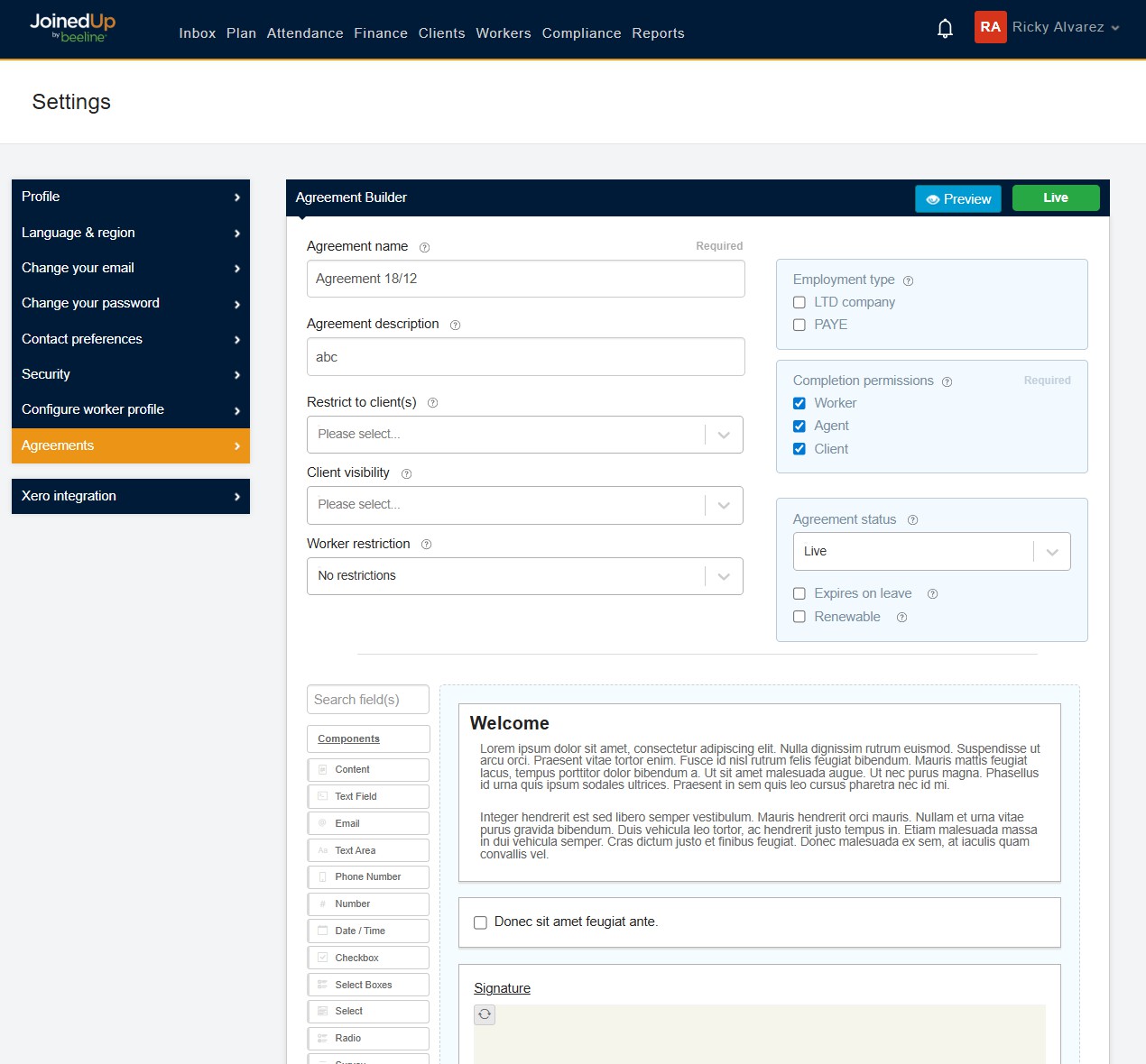
At the top of every agreement, you will find the agreement settings.
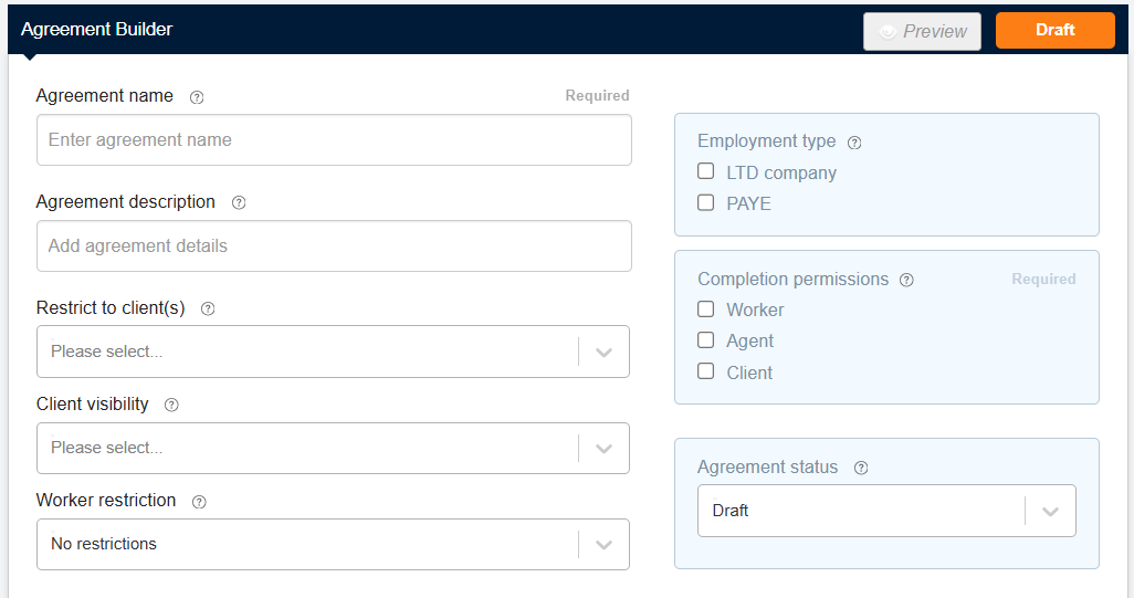
The following settings are available:
- Agreement name
-
The title of the agreement.
- Agreement description
-
An optional field for additional context or notes.
- Restrict to client(s)
-
Restrict the agreement to workers of specific client(s) only.
- Client visibility
-
Allow selected client(s) to view the agreement from the worker’s profile.
- Worker restriction
-
Make the agreement available to all workers, drivers only, or non-drivers only.
- Employment type
-
Make the agreement available to specific employment types only.
- Completion permissions
-
Specify which user types can complete the agreement.
- Agreement status
-
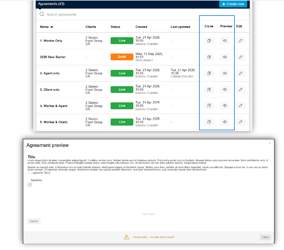
Set to Draft, Live, or Archived. Only Live agreements are visible on worker profiles.
Agreement Statuses
Agency Admin View
The following statuses are available when creating or managing agreements in the Agreement Builder:

The agreement has been created but not yet published. Not visible to workers.

The agreement is published and available in worker profiles.
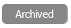
The agreement is no longer active and not visible from worker profiles.
Worker, Agent and Client Views
Statuses shown to each user type reflect whether they need to act or are waiting on someone else.

This user type can complete the agreement; action is needed from them.
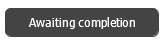
One other user type needs to act. Displays as 'Awaiting [user type]' as appropriate.

Multiple other user types can complete it but the current user cannot.

The agreement has been fully submitted.
Building an Agreement
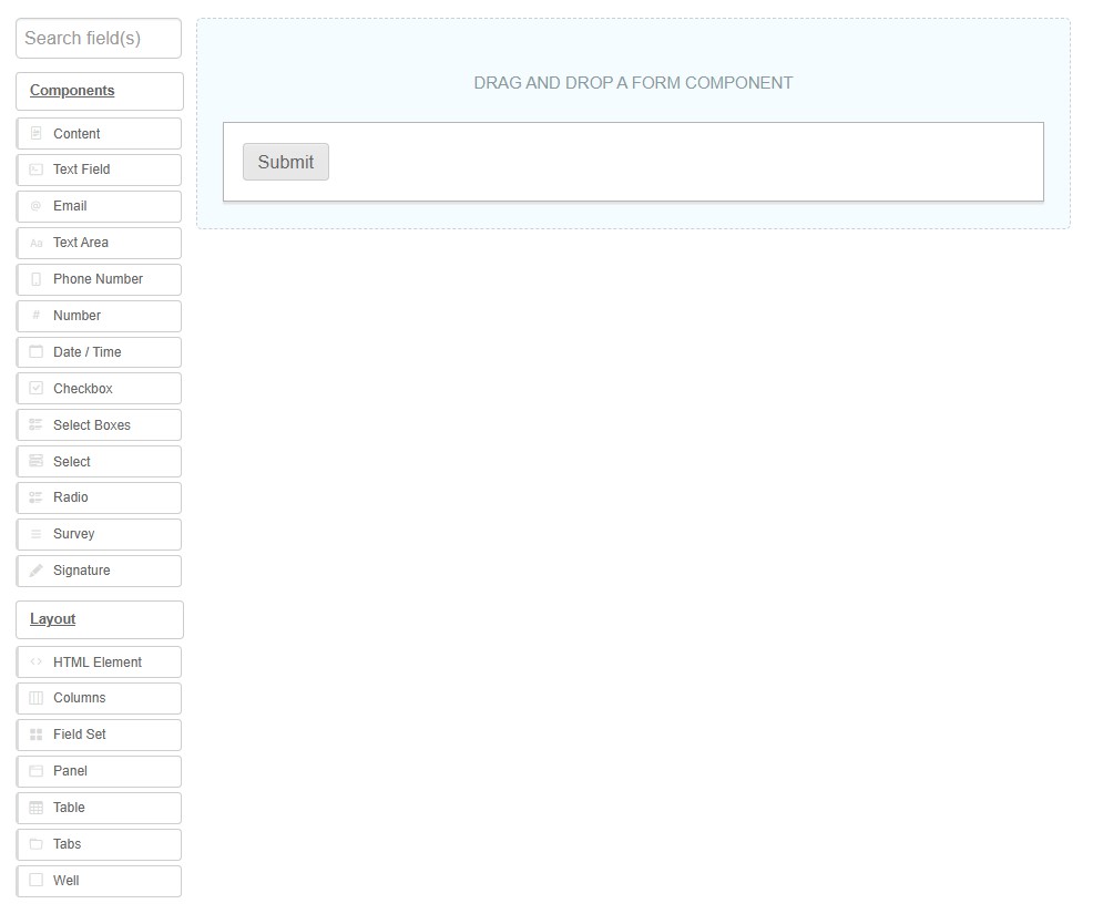
The Agreement Builder is made up of flexible fields you can select and edit to your own needs:
-
Components and layout options can be dragged from the list on the left into your form on the right.
-
The Submit button is mandatory and cannot be removed.
-
Once set, fields can be moved around as needed.
Each field has several editable options found within the tabs in the pop-out modal window:
-
Display — Field-specific options. See Display Tab.
-
Data — Key for fields with multiple set values (e.g. Radio buttons, Select). See Data Tab.
-
Validation — Set field validations. See Validation Tab.
-
Conditional — Only show the field under set conditions. See Conditional Tab.
Hover Buttons
There are buttons available on every component in the Agreement Builder on hover.
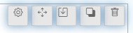
Edit - Opens the edit modal window.

Move: - Moves the component to a different location.

Paste below - Pastes a copied component below this one. This button appears after a component has been copied.

Copy - Copies the component or group of components.

Remove - Deletes the selected component.

Agreement Content
Display Tab
The Display tab has several options you can use to enhance the information given to the worker:
- Label
-
Appears next to the text input.
- Placeholder
-
This text appears in the input box to guide the user before they have entered anything.
- Tooltip
-
Appears as a (?) icon to offer the user additional help.
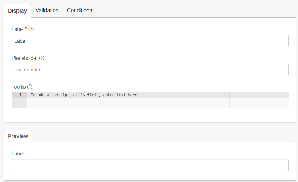
See the preview at the bottom of the editor to see how the component will look to the user.
Data Tab
The Data tab is key for fields where multiple options are given to the user, such as:
-
Select boxes
-
Select
-
Radio
-
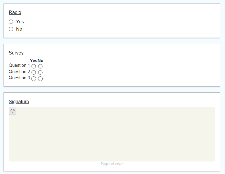
Survey
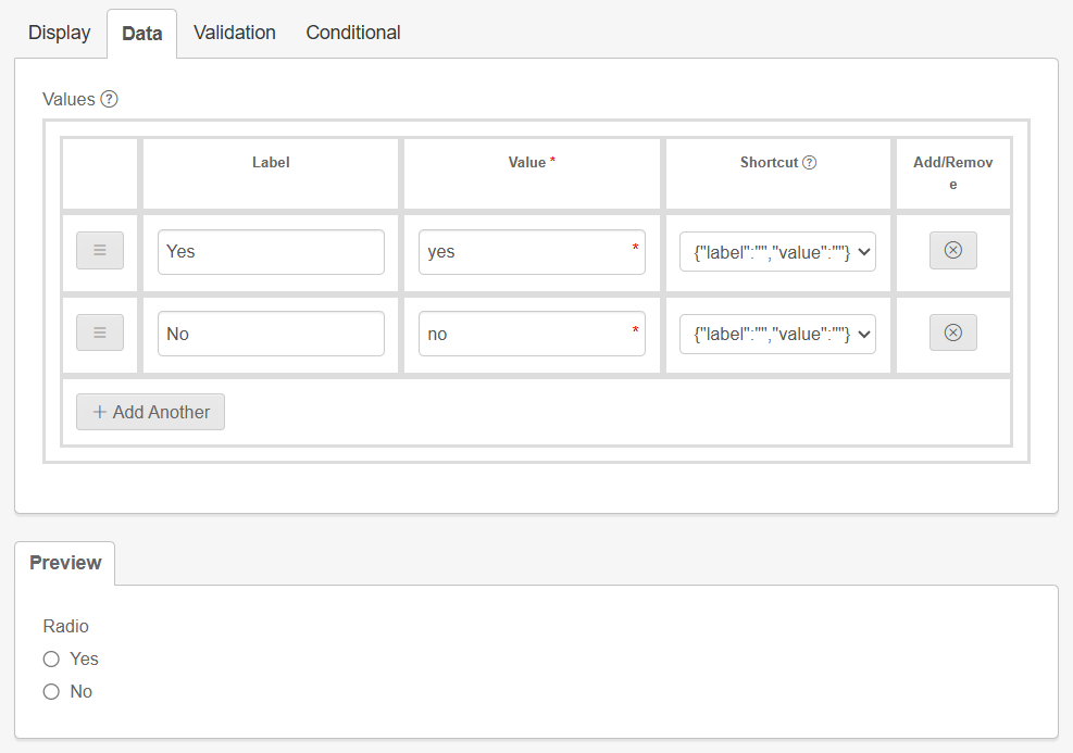
Input your options into the label boxes. You can add additional rows or remove existing rows as required.
Validation Tab
In the Validation tab, you can set a field as required. The user will not be able to submit the agreement without completing this field.
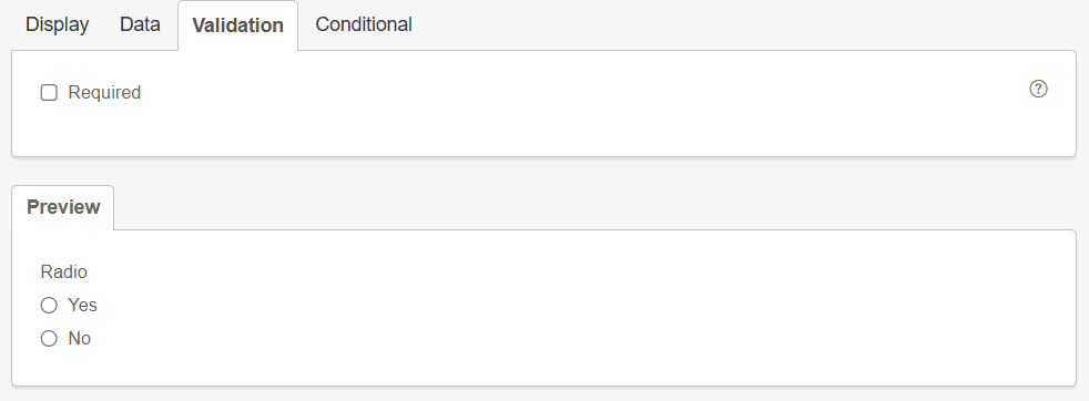
- Required
-
Tick this box to make completion of the selected field mandatory.
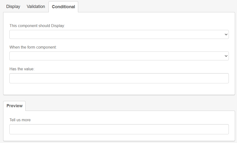
Conditional Tab
The Conditional tab is available for all fields. Use it when additional information is required; for example, when a worker gives a specific response to a radio button or survey question.
Best used when additional information is required, for example, when a worker gives a specific response to a radio button or survey question.
| For the Has the value field, use lower case. |
Components
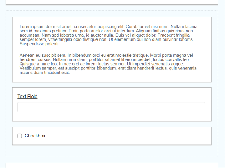
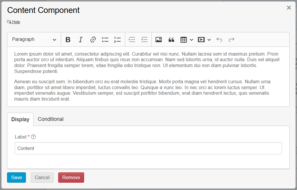
Content
A Content component provides static content such as contextual language, headers, or media. Use it to provide instructions that do not require input from the user.
-
Text and paragraph editing options are available.
-
You can upload images within a Content component if needed.
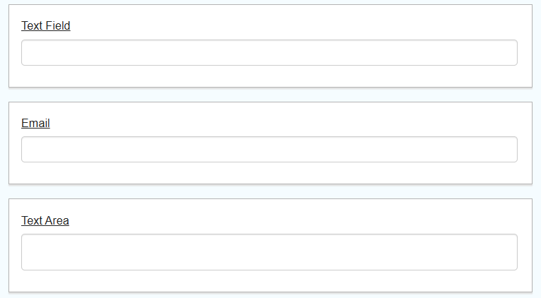
The Email component carries special input validation, ensuring the entered data is in a valid email format.
Text Area
A Text Area is a multi-line input field that allows for longer text. The number of rows can be selected in the edit window.
Phone Number
The Phone Number field carries an editable input mask to force the user to enter data in a phone number format.
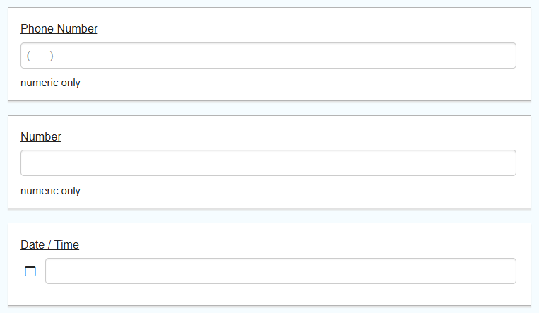
Date/Time
The Date/Time field opens a calendar with a date and time picker. It can be configured to show only a date or only a time if required.
Check Box
A Check Box can be checked or left unchecked. It is often used as a required field; this can be set in the Validation Tab.
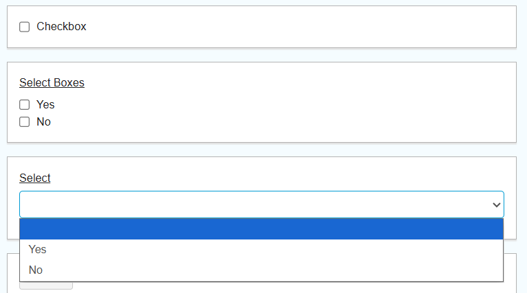
Select Boxes
Select boxes allow the user to select one or more options in a checkbox-style format. Set the values within the Data Tab.
Select
The Select component displays a list of values in a dropdown list where users can select one value. Set the values within the Data Tab.
Radio
A Radio component allows users to select a single option from a list. It can be used in conjunction with a conditional field if you require additional information from the worker.
Layout
HTML Element
Add an HTML Element to display a single HTML element in a form. This is useful for quickly inserting and configuring HTML in your form.
A common use case is to add vertical space between components by entering <br> into the content box. This component can then be copied and placed wherever needed.
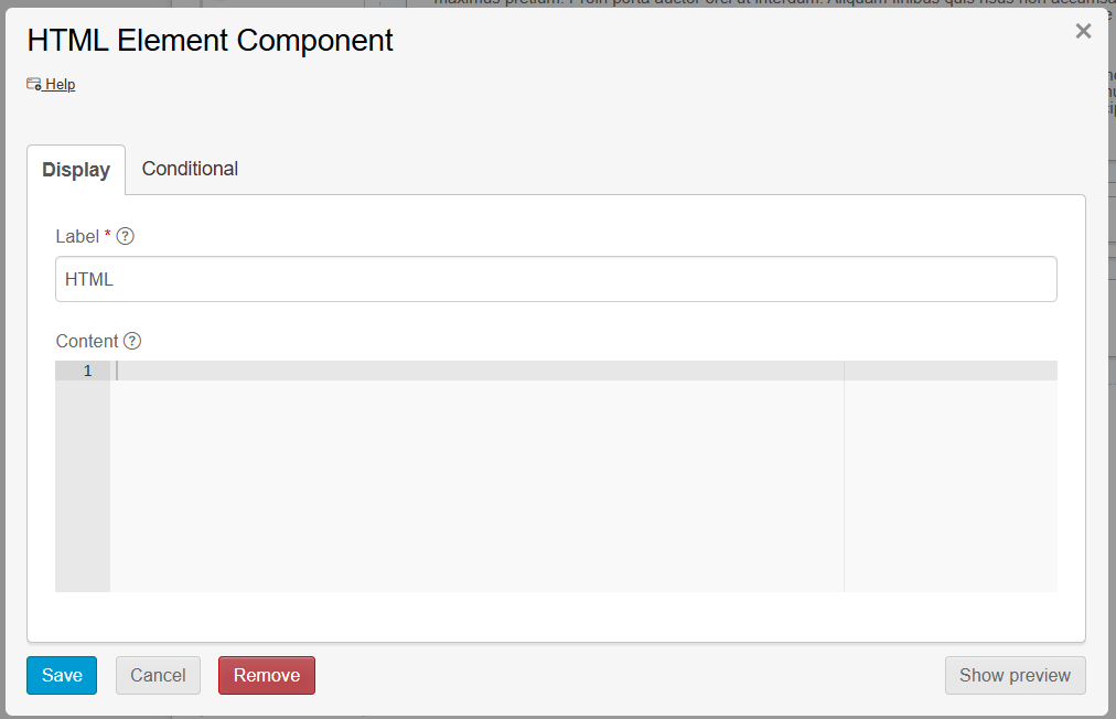
| Outside of simple use cases such as line breaks, this component should be used by proficient HTML users only. |
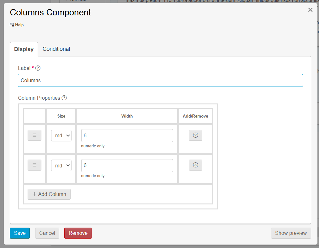
Columns
The Columns component groups other components into configurable columns. Use it to display multiple components inline and save vertical space on a form. Columns collapse when the form is rendered on a mobile device.
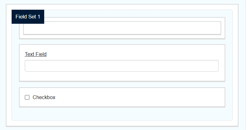
Field Set
Field Sets allow you to group multiple fields together in a form. They help organise related fields visually and logically, making it easier to manage and present complex forms. Field Sets can be used to group fields under a common heading or section.
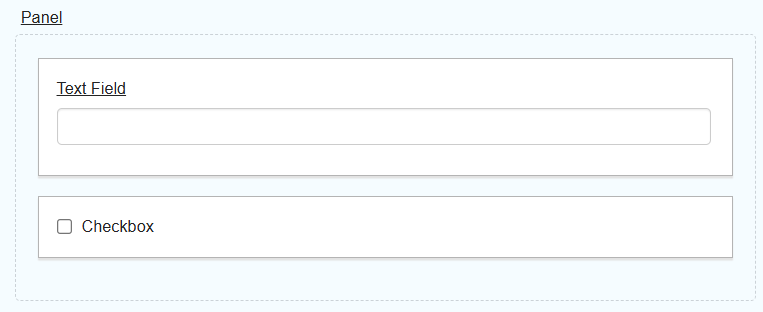
Panel
Panels are used to organise and group other form components into their own section. They help structure forms by visually separating different sections or categories of information.
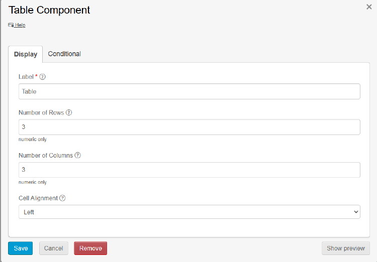
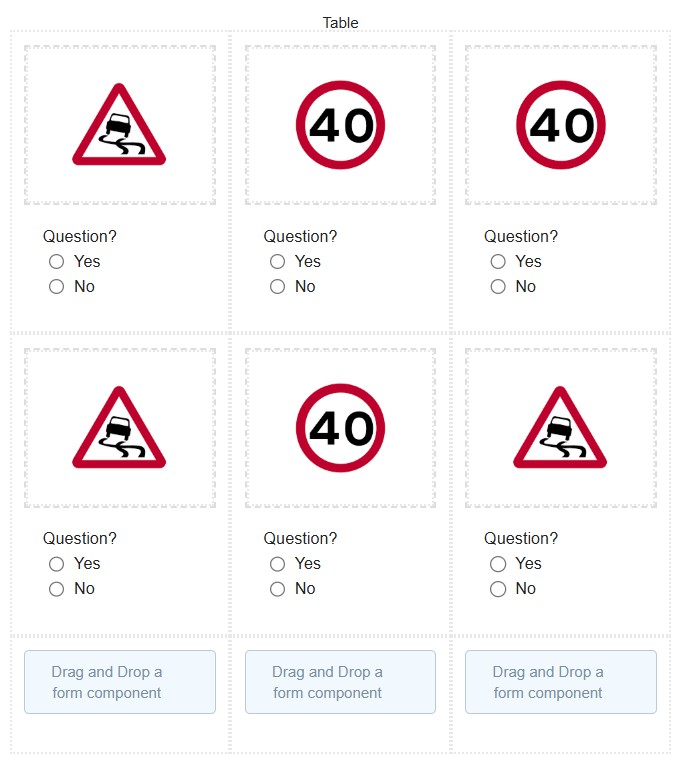
Table
The Table component arranges and presents form fields in a table-like layout. It is particularly useful for forms that require a clear, organised presentation of fields that benefit from a tabular structure.